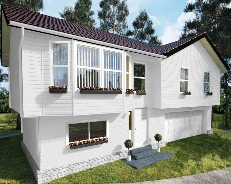
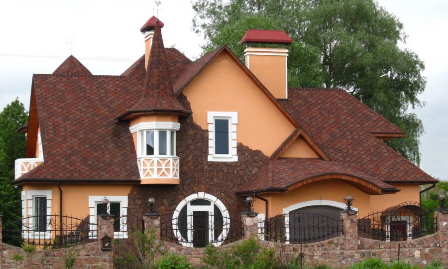
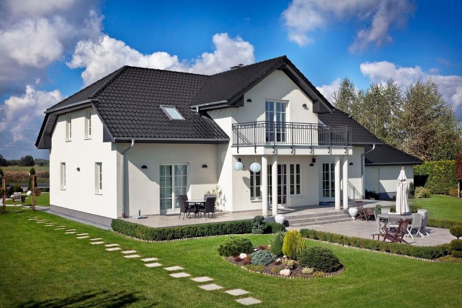
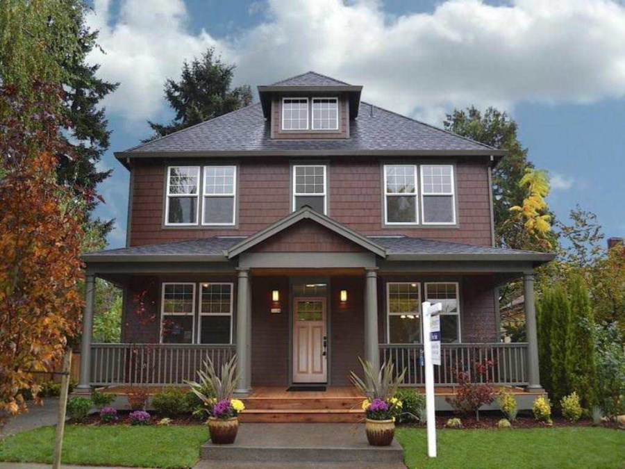
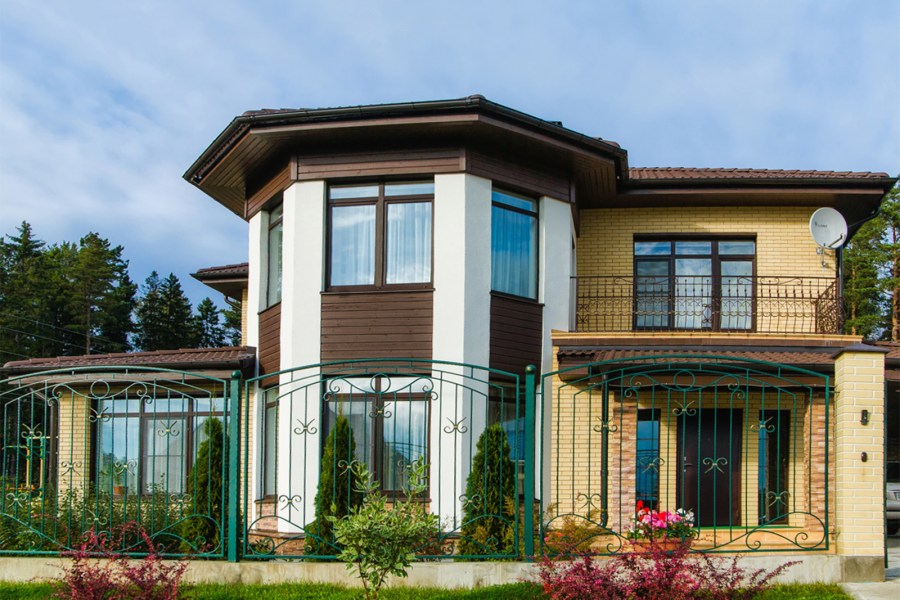
Facade color - the rules of choice and a successful combination. 100 photos of options for a beautiful design of the facades of a private house
When deciding on the design of a facade, consider factors such as climatic and weather conditions, nearby buildings, and landscape. Combining colors harmoniously, you can create beautiful architectural ensembles. Photos of examples of a beautiful facade with successful color combinations clearly demonstrate this.
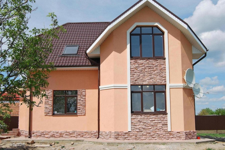
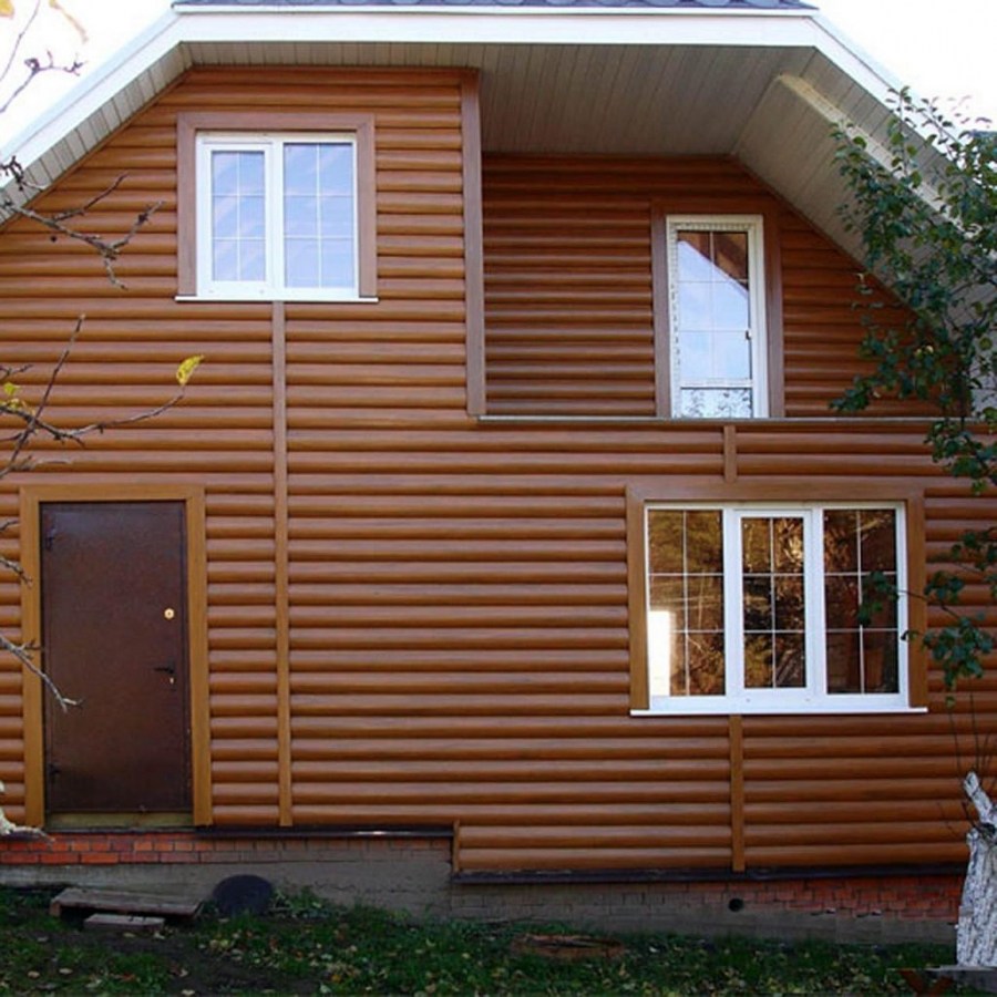
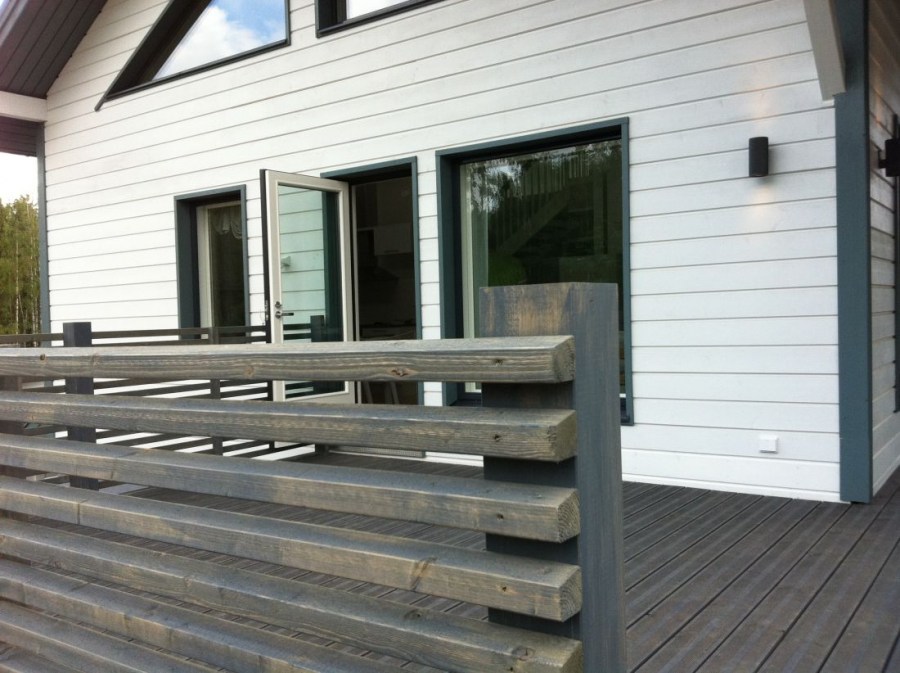
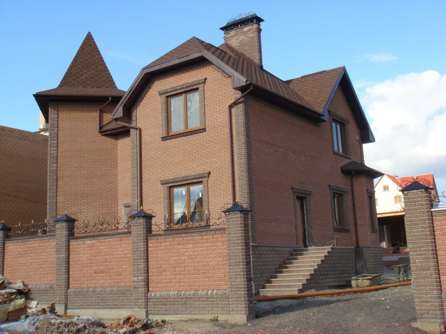
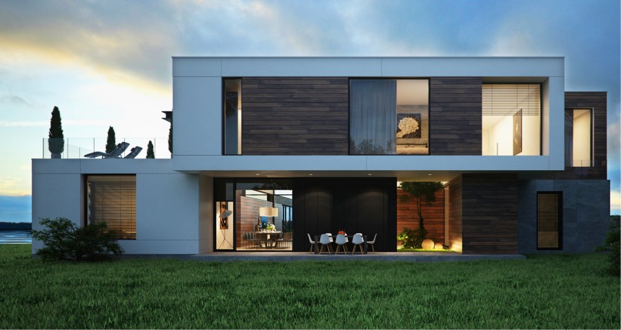
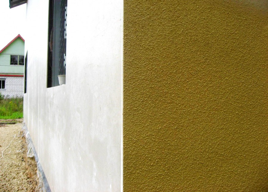
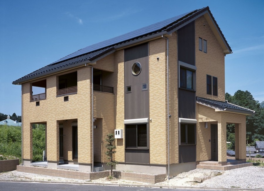
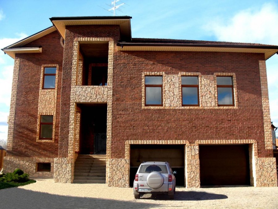
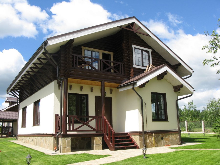
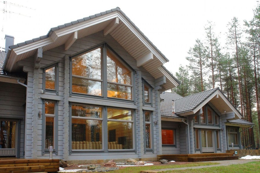
The texture and properties of facing materials sometimes prompts the color scheme itself. Wood and stone have their own unique natural shades, which significantly affects the whole look of the house.
Facade decoration
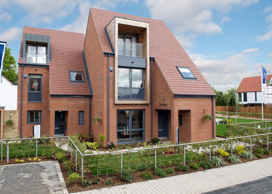
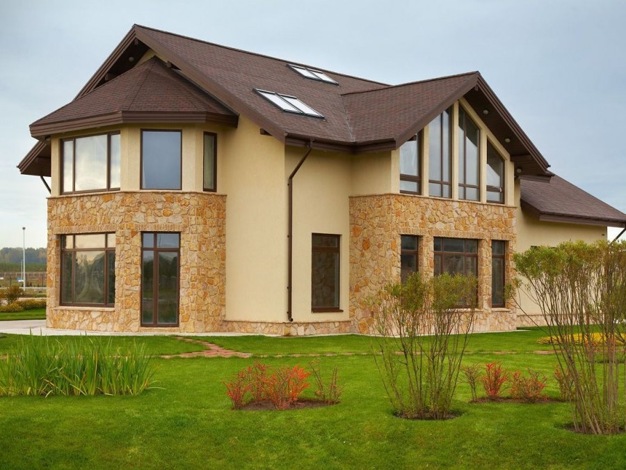
The texture of the natural material in the cladding and lighting affect the perception of color in different ways. Structural elements must be in harmony with each other, creating a single ensemble. Stone and wood can be successfully combined with glass, mosaic or metal. The combination of shades of the roof, facade and basement are carefully thought out to create a holistic image of the building.
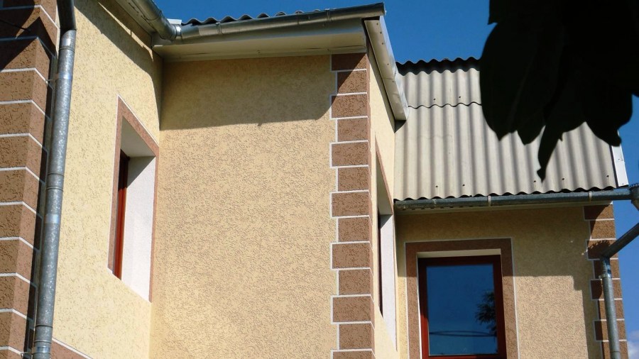
Typically, for finishing plastered walls, paint is used that is resistant to the effects of weather and temperature extremes. For painting metal surfaces, steel, black paint is suitable. Metal alloys are coated with vinyl chloride or varnish.
Features of color selection
What color is best to choose for facade design, a competent specialist will help. For selection, you can use special programs online. In any case, adopt the basic rules to avoid common mistakes.

It is always better to give preference to lighter colors. Too bright, saturated and dark is more difficult to harmoniously include in space, and besides, they quickly tire the look.
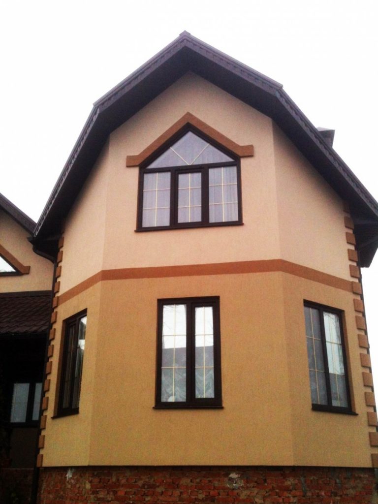
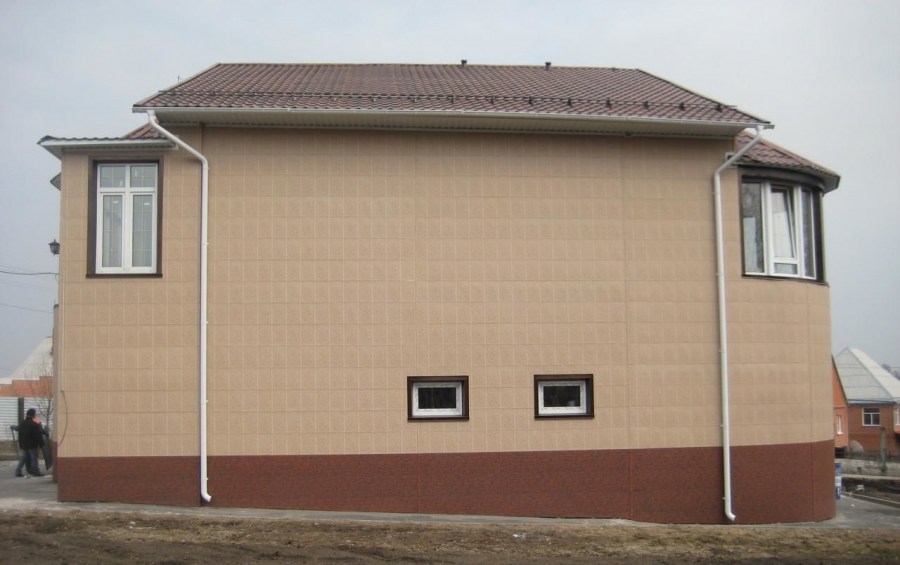
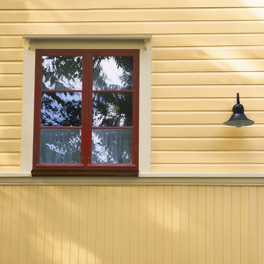
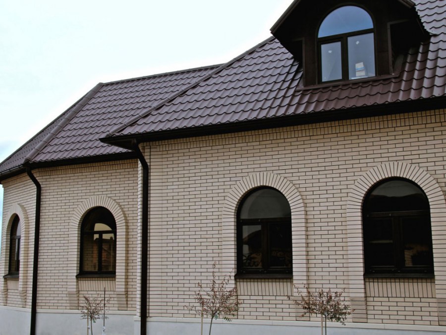
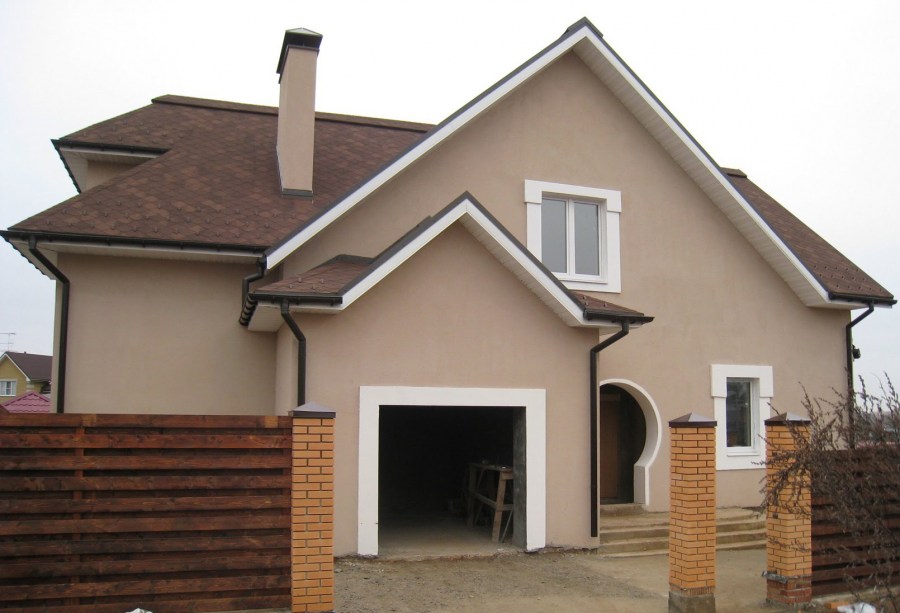
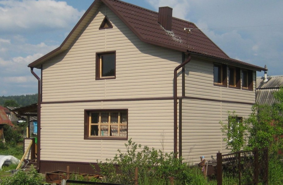
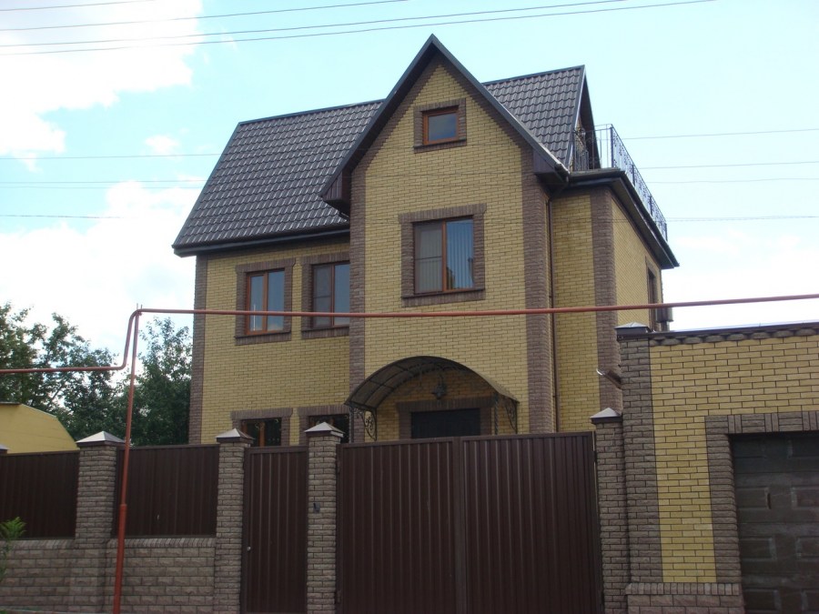
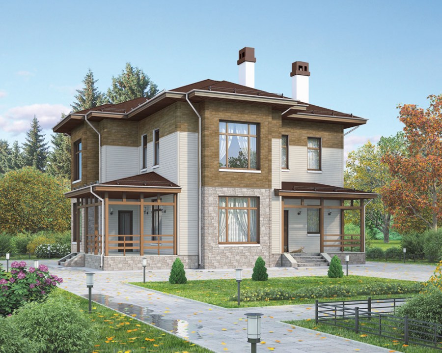
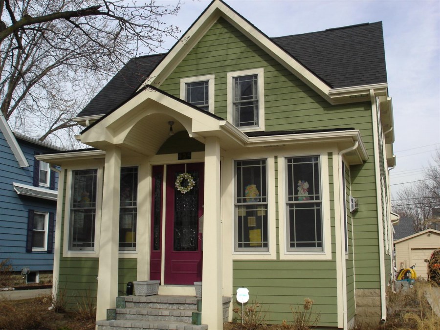
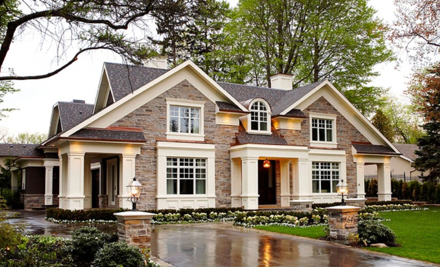
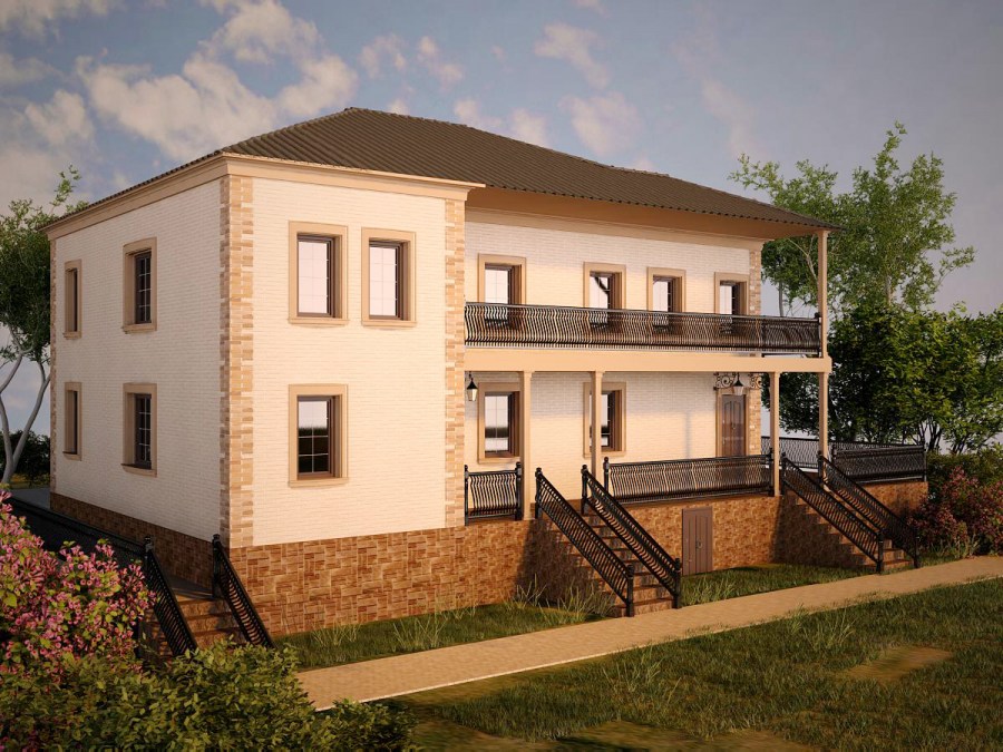
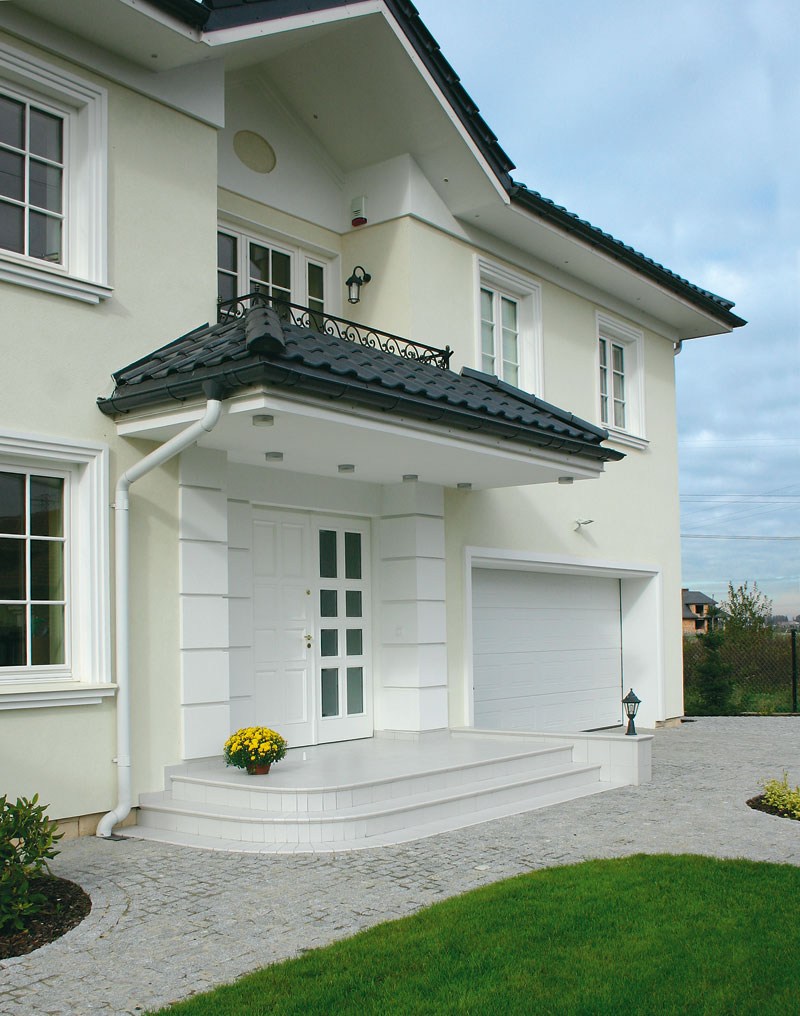
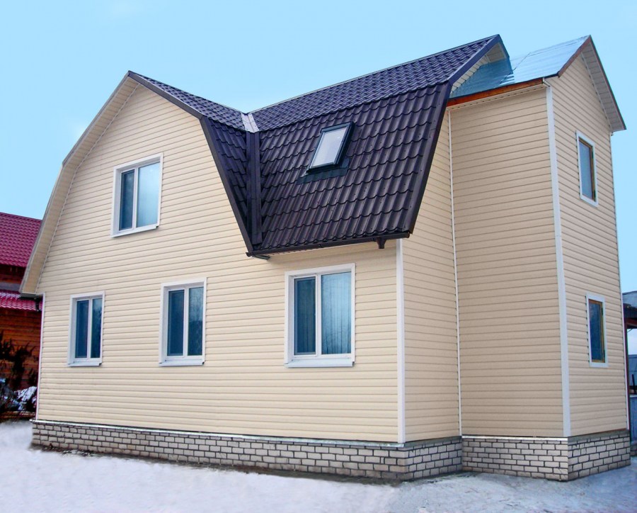
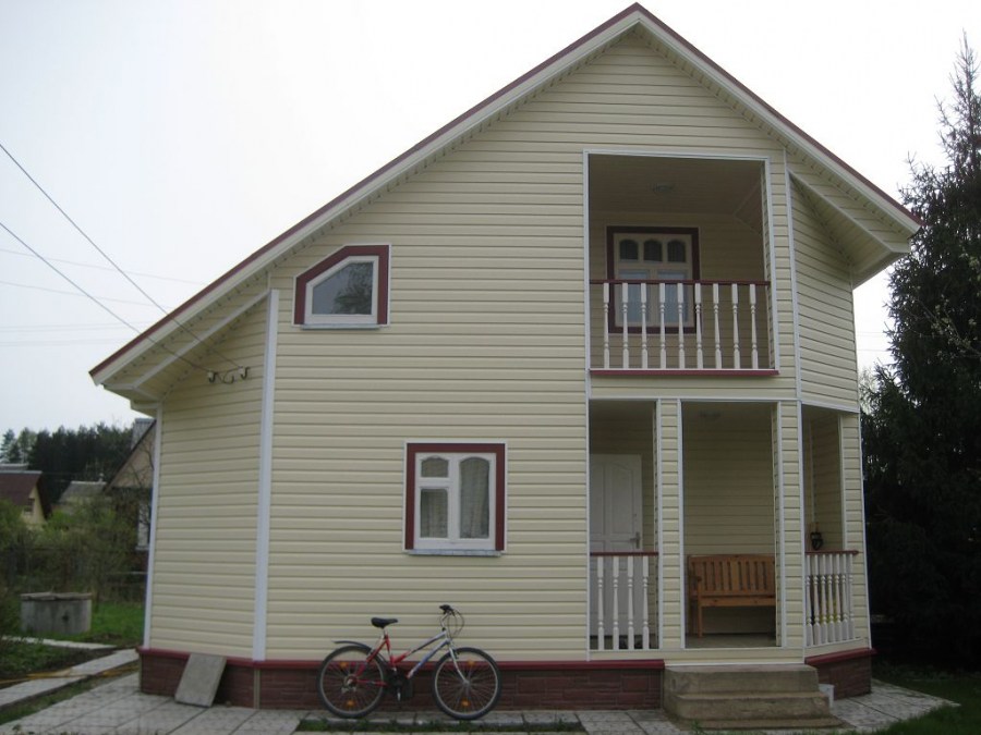
Shades of one gamut are well combined: brown with beige, blue with blue, etc. White is versatile and combines with any shades.
Try to take tones that are close to natural - this will provide you with the best combination of facade color with nature and adjacent buildings. Competent staining will help to emphasize the advantages of the finish and smooth out the flaws a little.
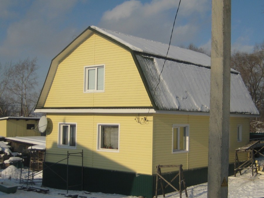
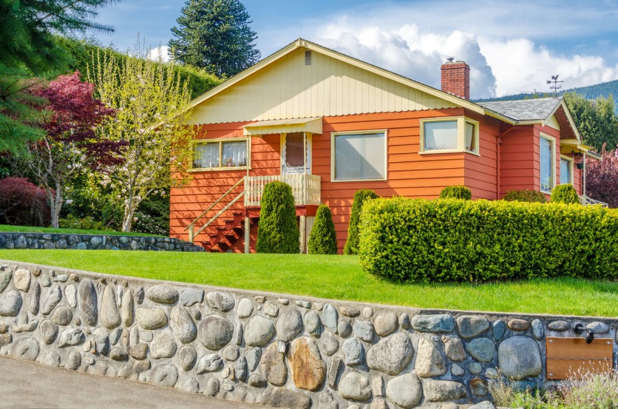
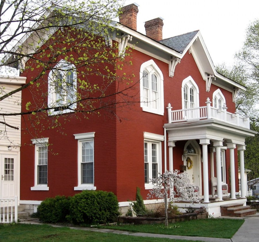
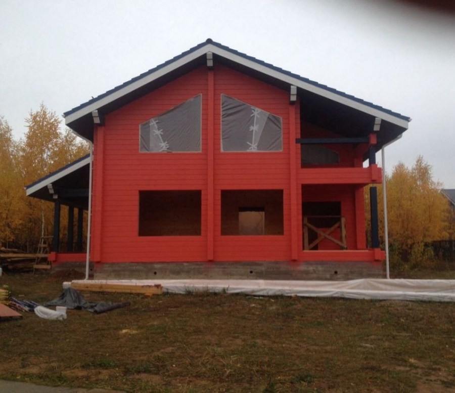
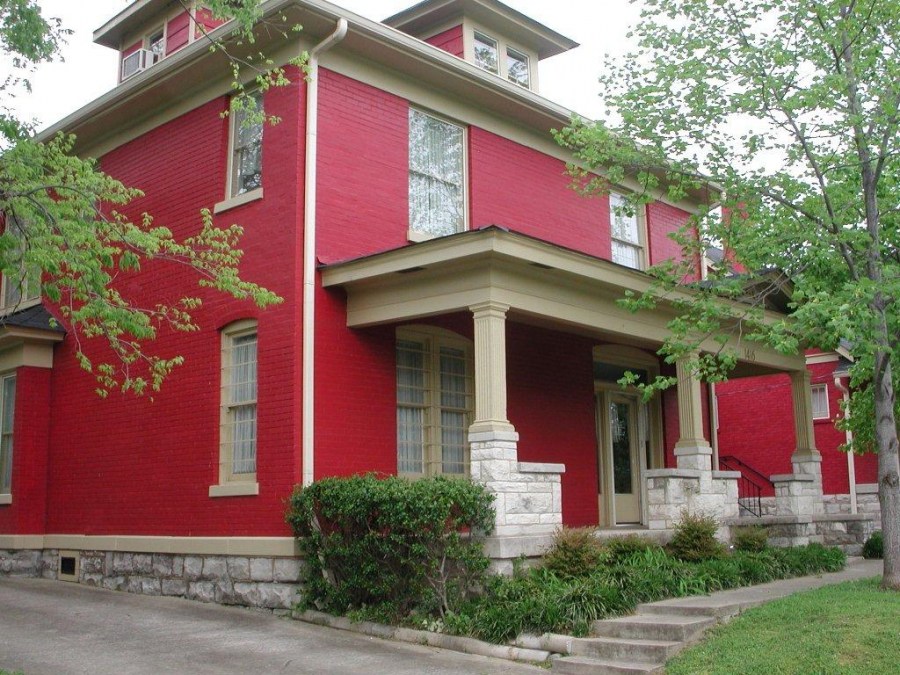
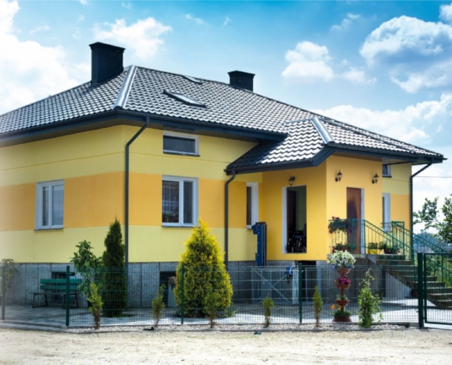
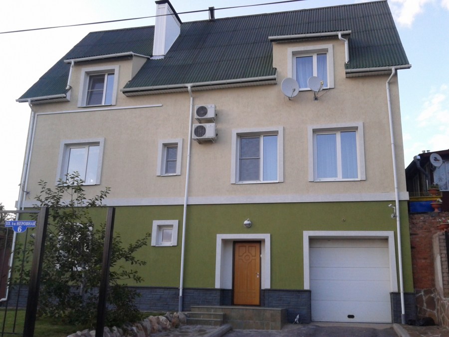
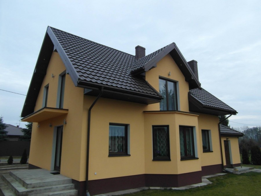
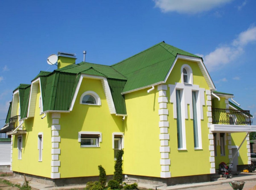
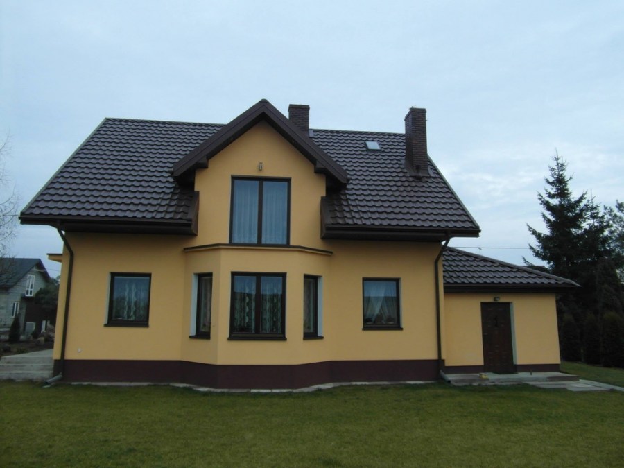
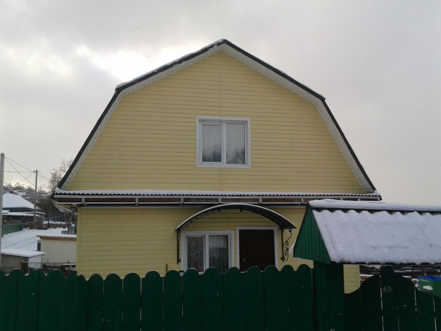
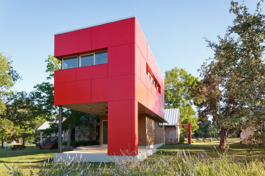
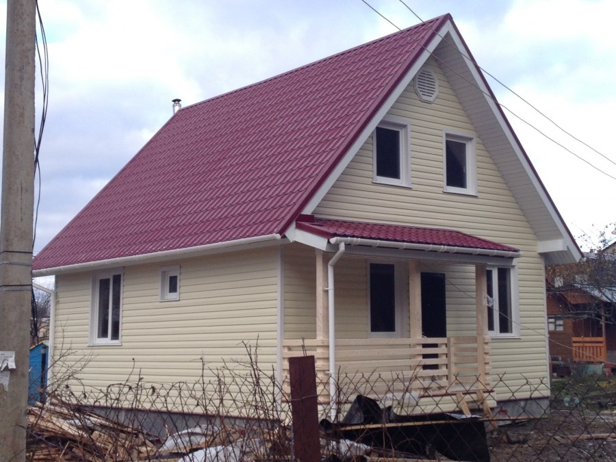
When choosing a bright color, keep in mind that visually this will increase the size and highlight the house against the surrounding background. Most often, warm yellow, brown, red are used to paint the walls.

With dark tones, you must be careful when using them in limited quantities. Shades of green are quite popular, which look quite organic in the bosom of nature and are great for suburban buildings.

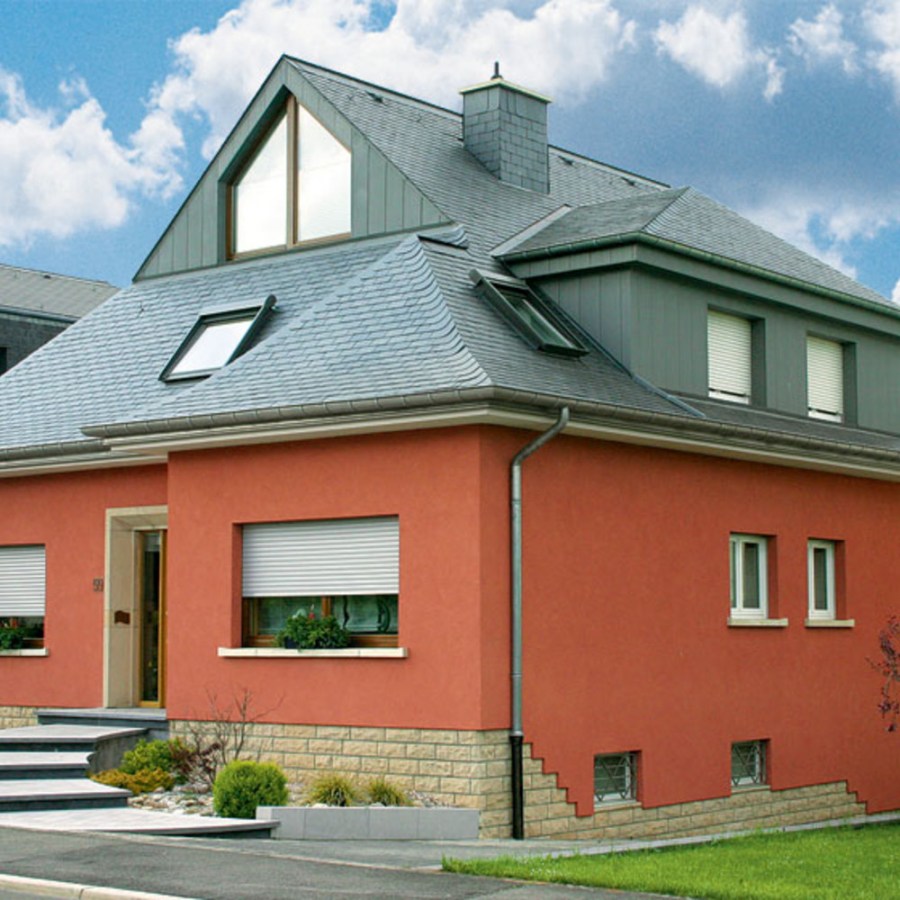
A fashionable modern trend is the use of terracotta. You can choose both bright and more calm, muted shades of it that set you to rest and relax. Using the catalogs of colors for the facade, you will find the right solution.
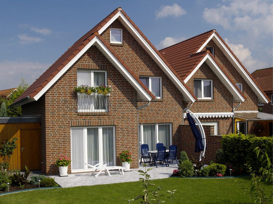
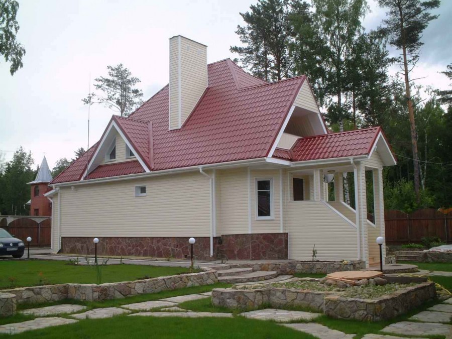
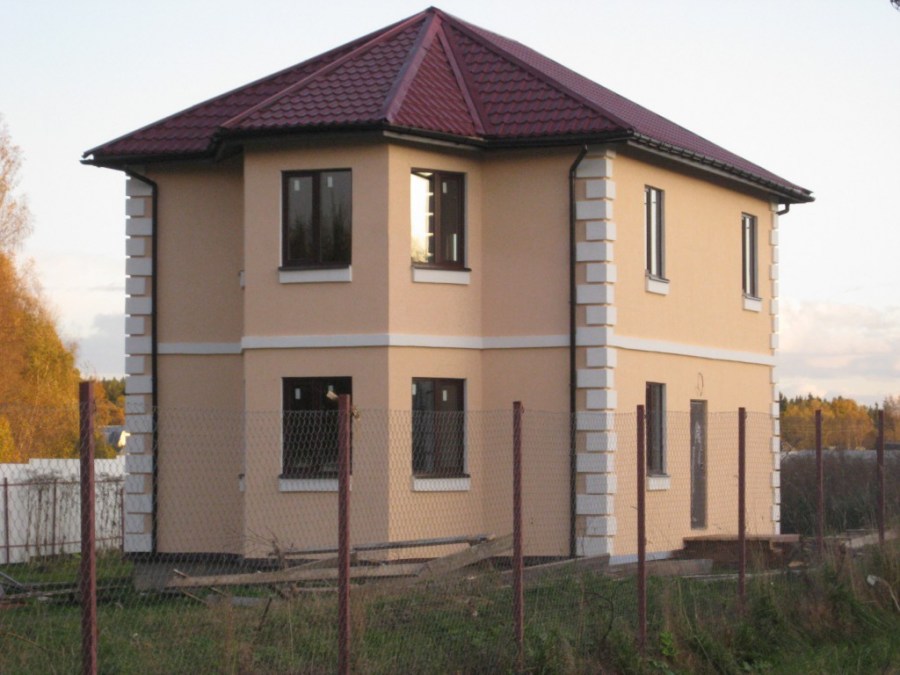
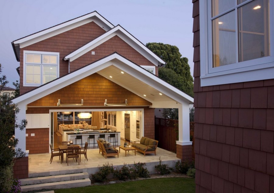
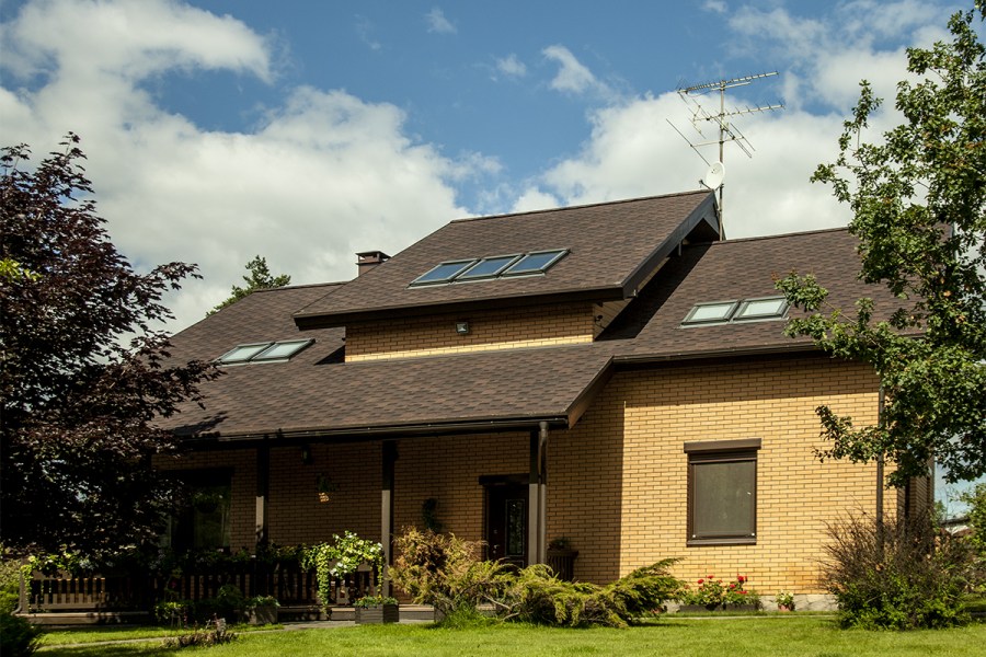
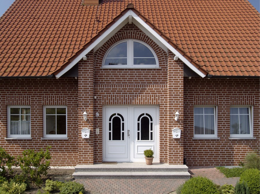
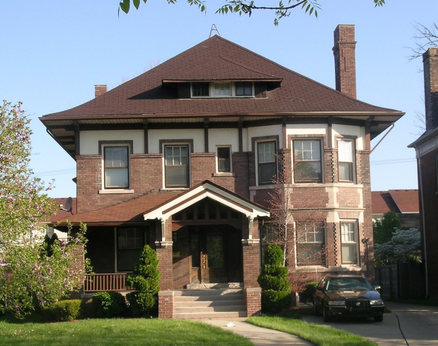
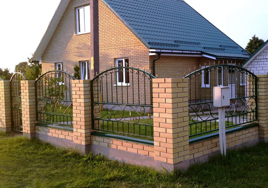
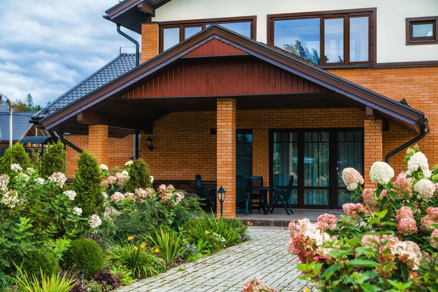
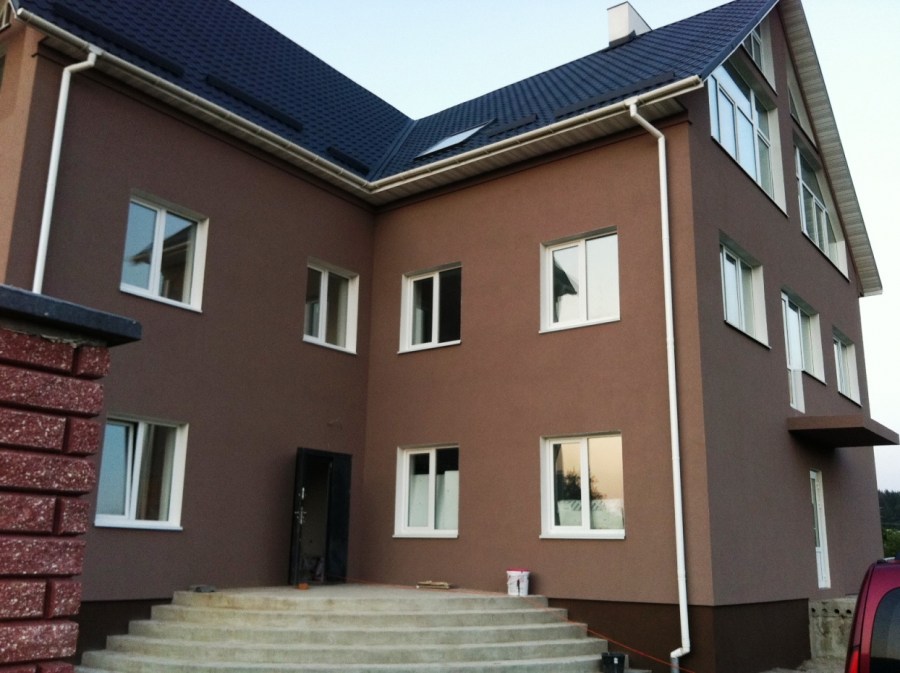
A common variant is brown-red tones, a range from copper to chocolate. It is optimal to use them in the decoration of buildings with a simple architecture.
Choose the paint, taking into account weather conditions and climate. The paint of organic origin has the ability to quickly fade from sunlight, and a dark color will enhance the heating of the facade, which will lead to its accelerated destruction.
Combination with adjacent objects
Coloring should be done, focusing not only on your taste preferences, but also taking into account the color scheme of buildings and structures nearby.
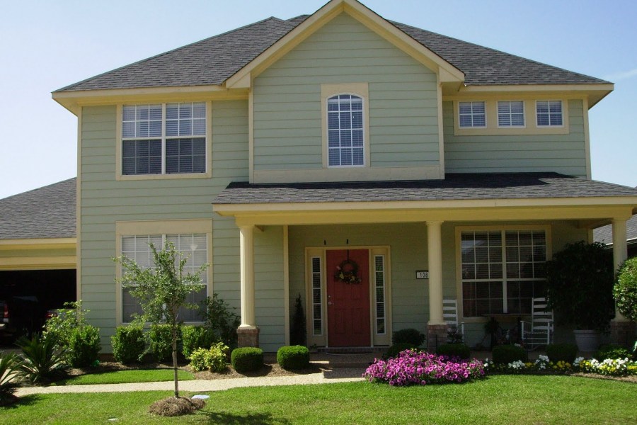
If the building is located on a historic site, it is necessary to observe the color scheme characteristic of the area.Traditionally for houses located outside the city, the most acceptable solution will be the use of soft pastel shades.
If the house is surrounded by greenery, immersed in shrubs and trees, it is best to use very light shades for painting. The building, standing in the open, can be revived with bright colors.

The south side of the house requires the use of muted colors - intense sunlight will make the facade lighter and brighter. Think about how the house will look at different times of the year - against the background of white snow or bright greenery.
With the help of coloring, you can focus on what you want to emphasize, and make some imperfections invisible.
The nuances of choosing a shade
Color creates a mood, affects the psycho-emotional state. It is better that professionals who will take into account all the nuances are engaged in its selection. However, you will easily understand how to choose the facade color yourself if you have at least a little experience with this.
General rules are as follows
- the choice of shade is significantly influenced by the style in which the building is made - from classics to modern solutions;
- well-chosen tones emphasize the style and beauty of the building, and unsuccessful ones level the features of architecture;
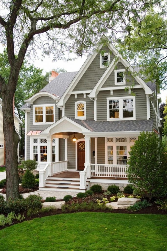
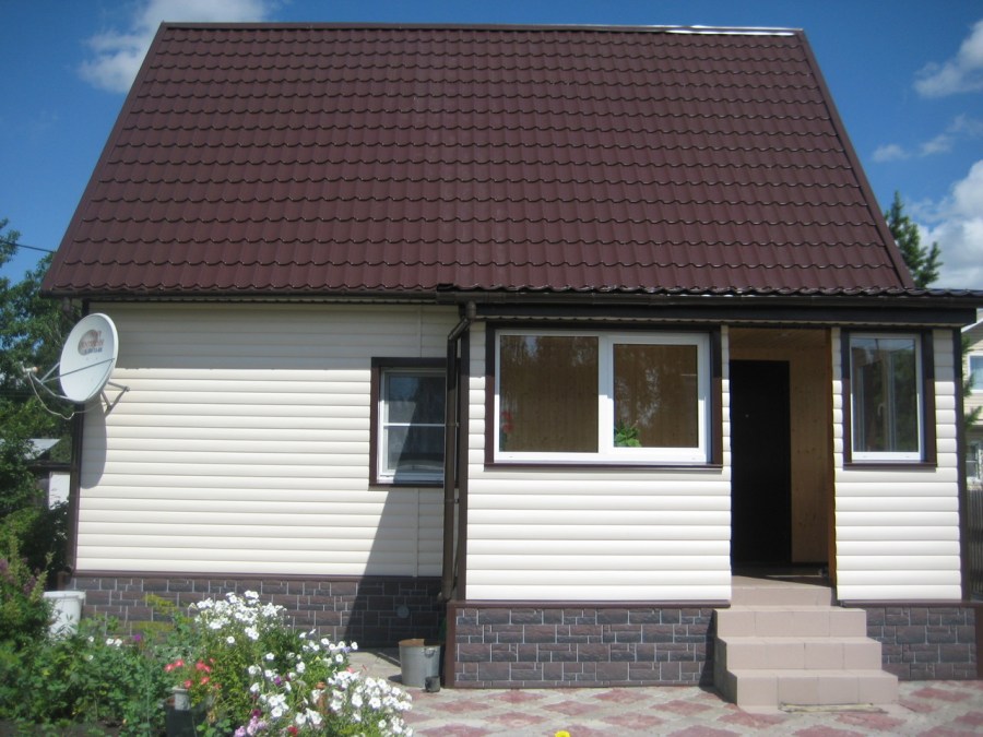
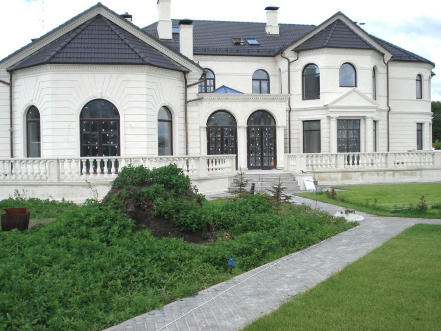
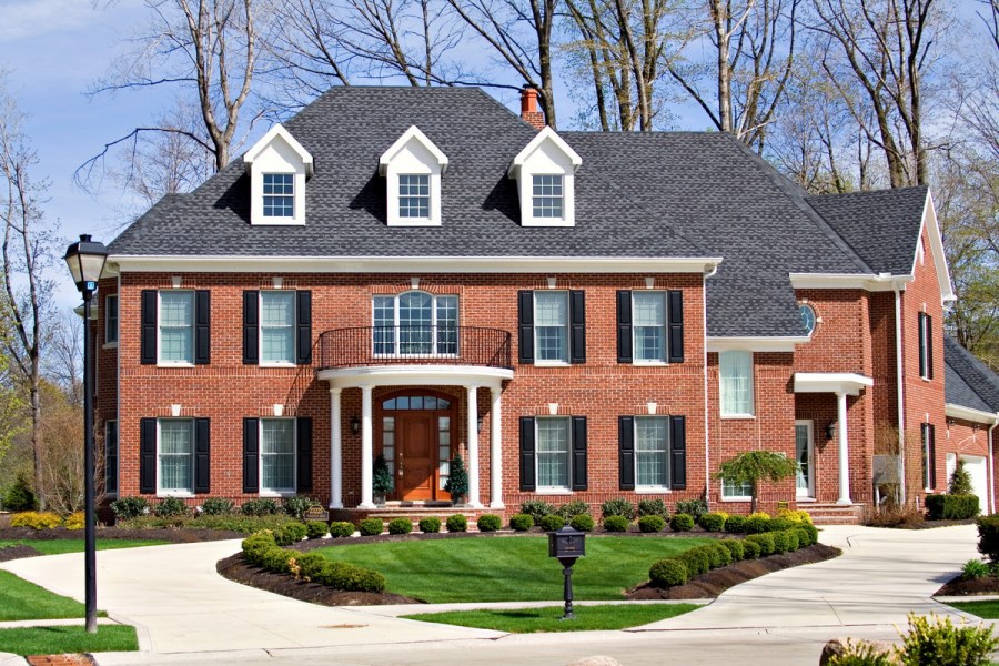
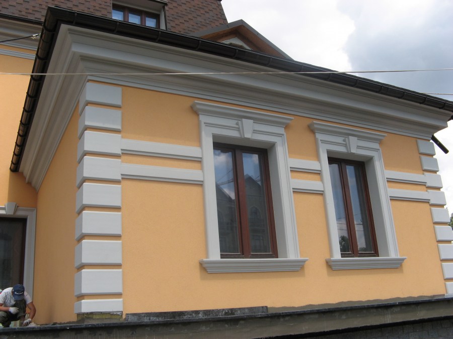
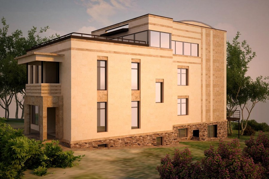
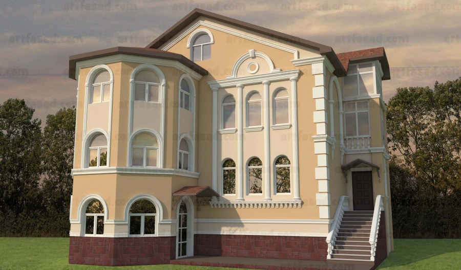
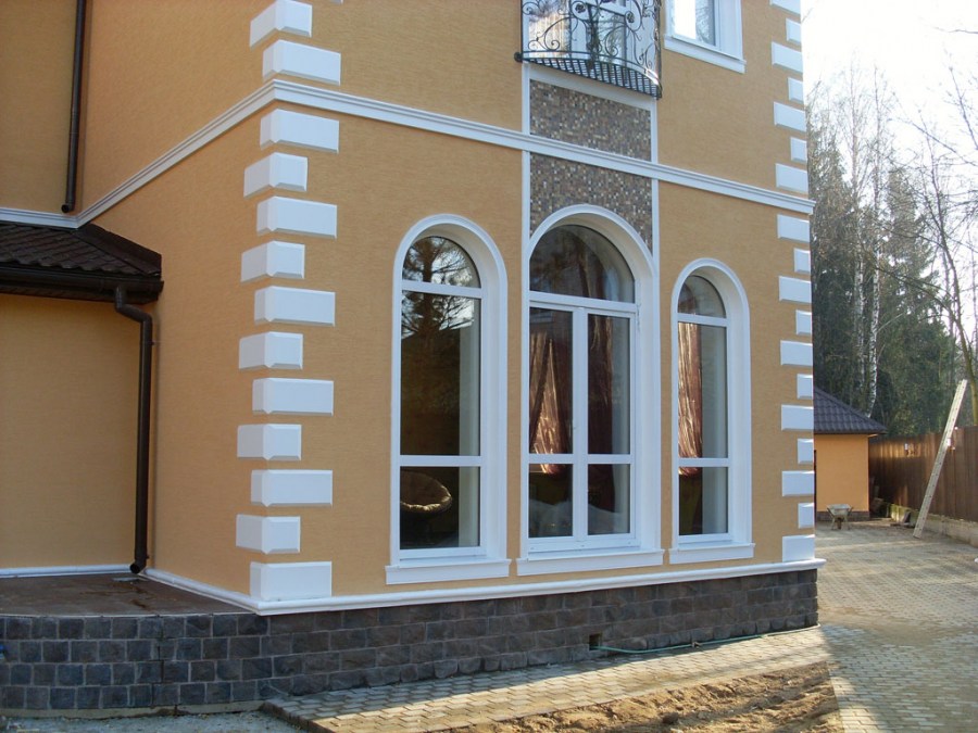
- for a building in a classic style, beige, white, milk shades are suitable;
- dark tones have the ability to attract sunlight and heat, so they are best used for buildings located in cold climates;
- consider in advance the fact that bright colors burn out faster in the sun;
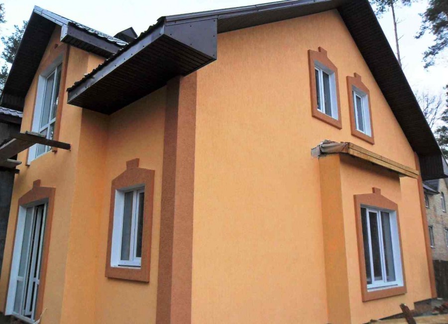
- To highlight small elements, use light colors;
- saturated and dark colors are best used if the building has a simple shape;
- dark tones highlight the shape of the object, light tones increase its volume.
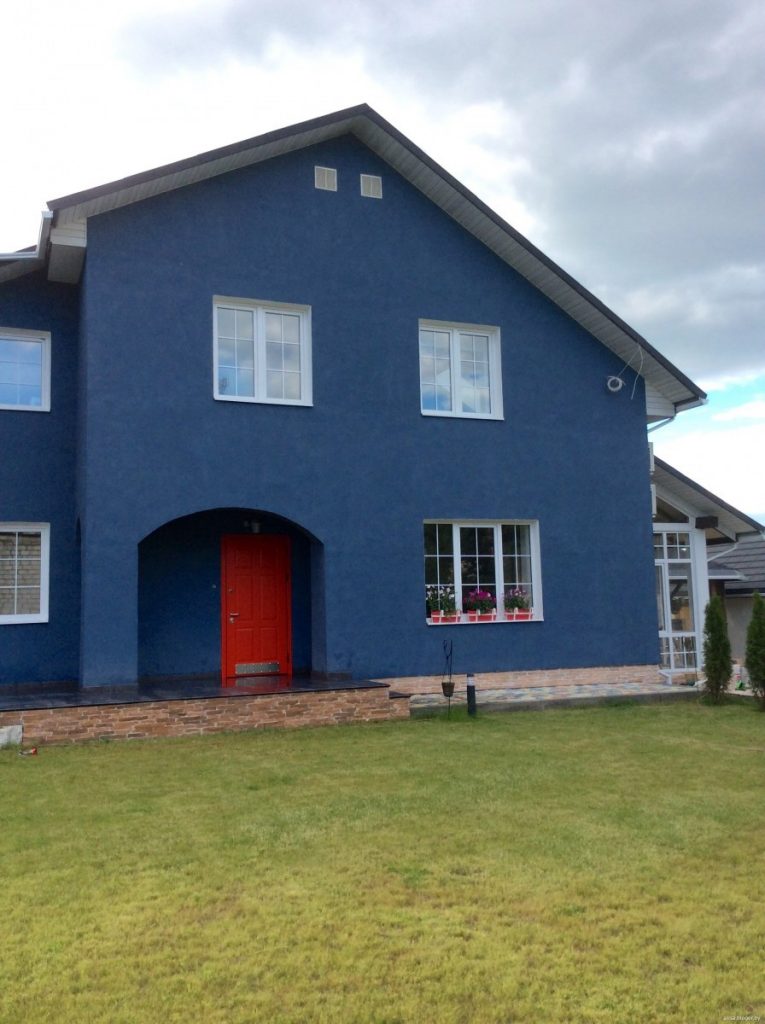
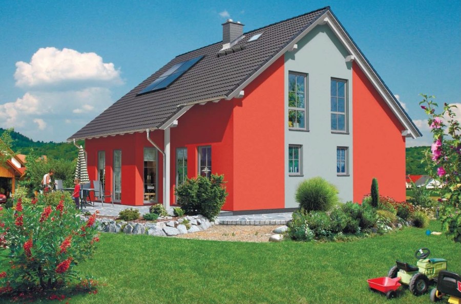
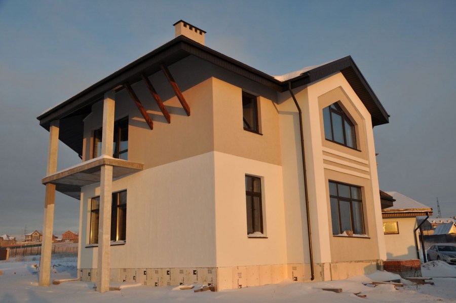
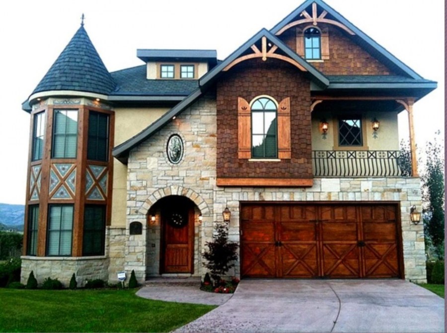
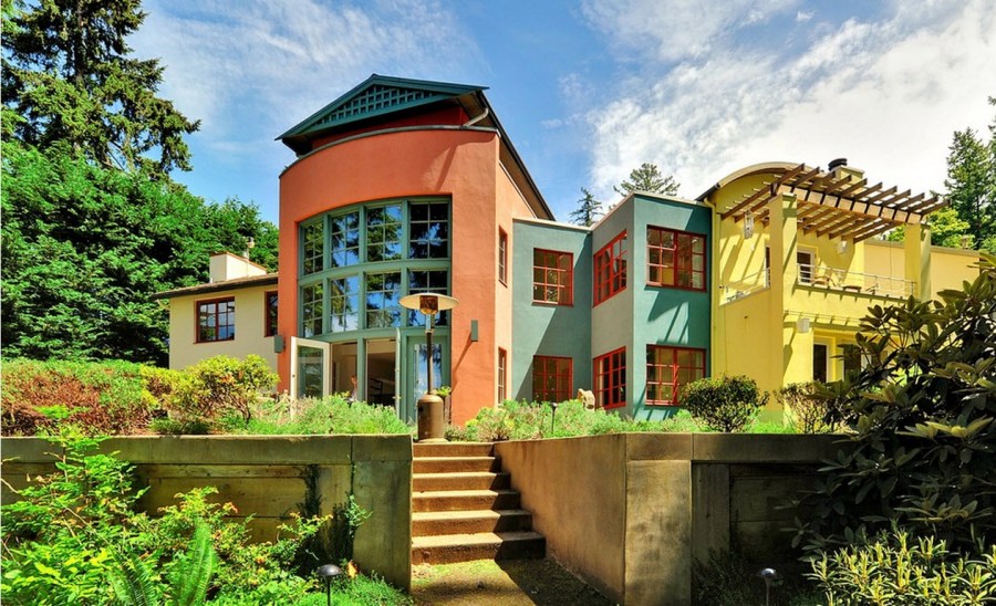
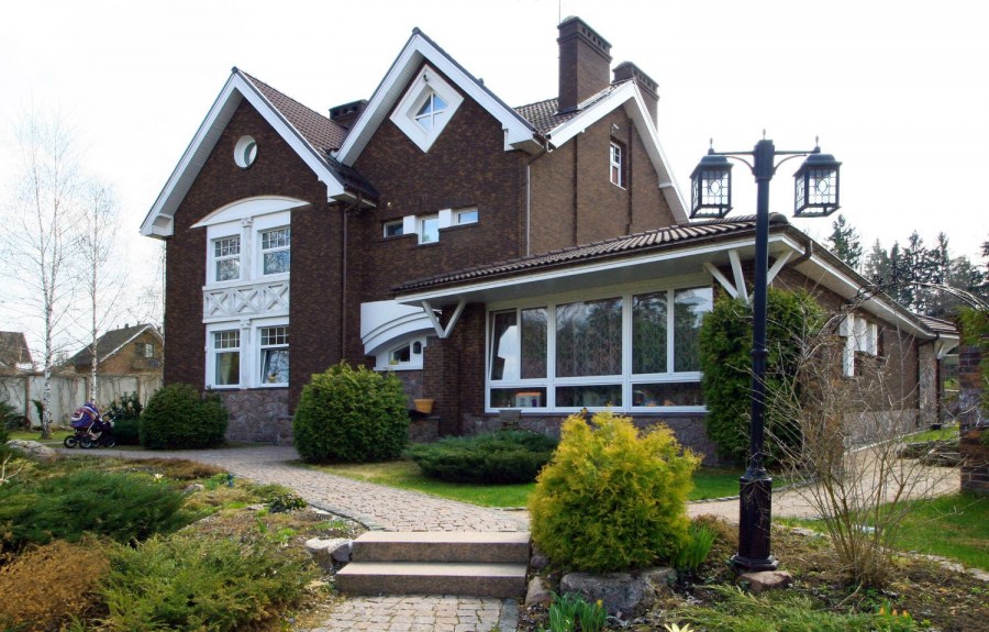
Multicolor facade
For design, you can use several shades at once, provided that they are correctly combined. This option will draw attention to the building, and living in it can become psychologically more comfortable. If your project involves a combination of several tones, you must consider the nuances that will facilitate this choice.
Using bright colors, it is convenient to create an accent by painting windows and doors with them. Take advantage of special architectural programs - this will save you a lot of time.
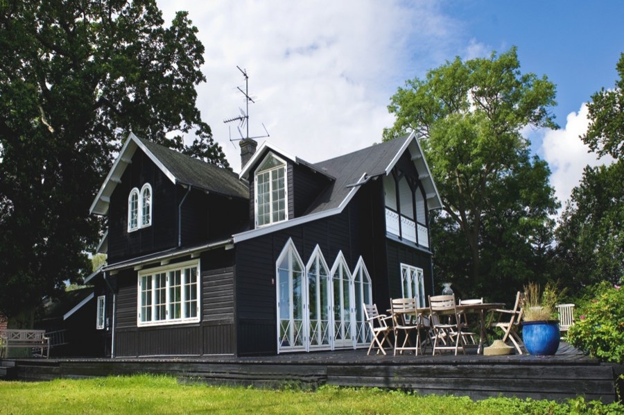
Evaluate the overall style of the building to choose the best combination. The facade and roof can be made in one color. In modern projects, the use of interesting contrasts for these parts of the building is allowed. Looks great, for example, a combination of black and yellow.
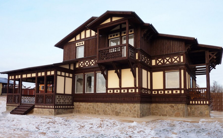
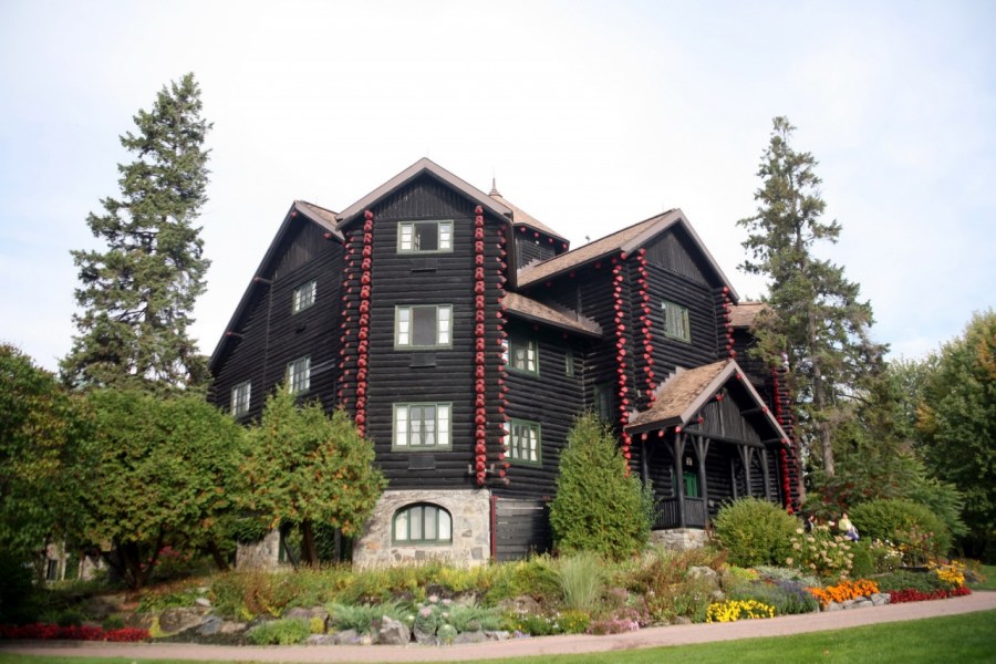
Wooden houses are best painted with glossy paints. But if the structure is located in a sunny area, give preference to matte paint.
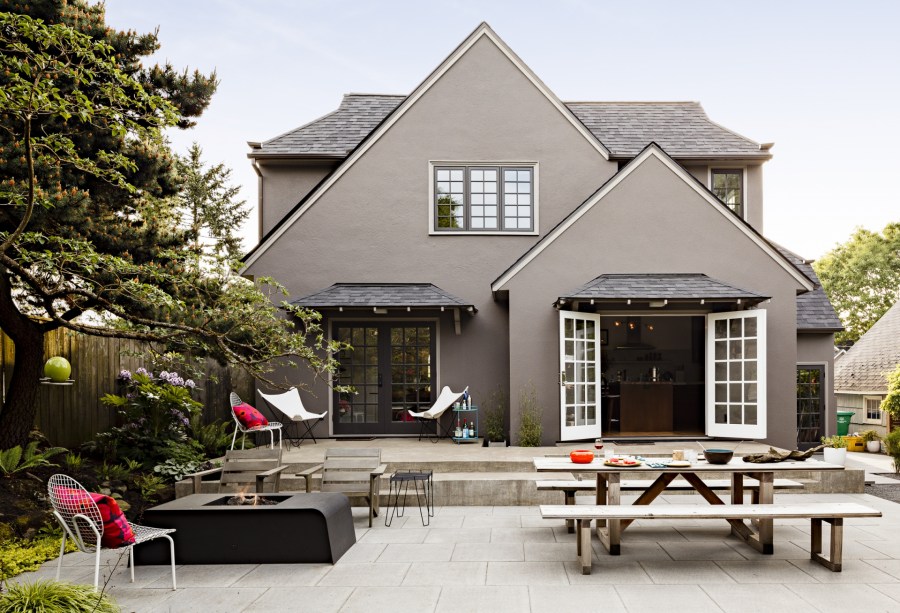
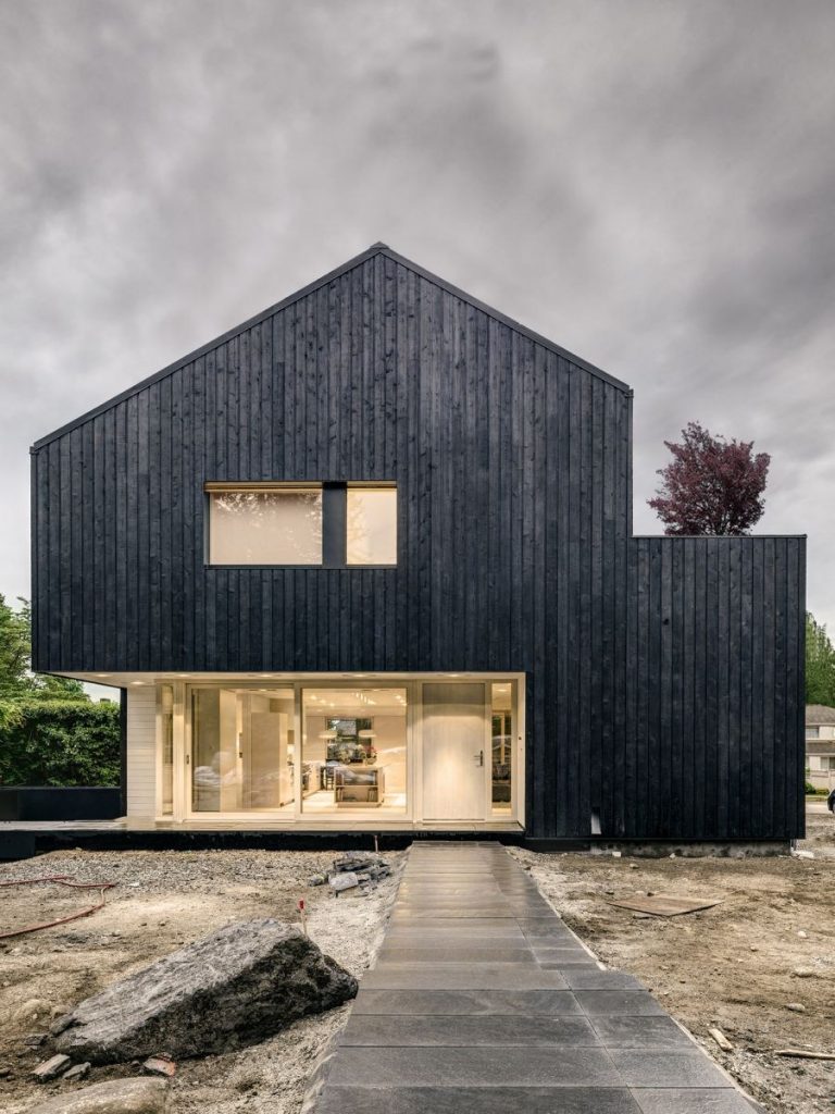
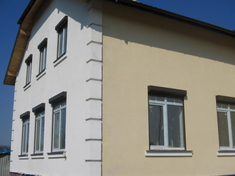
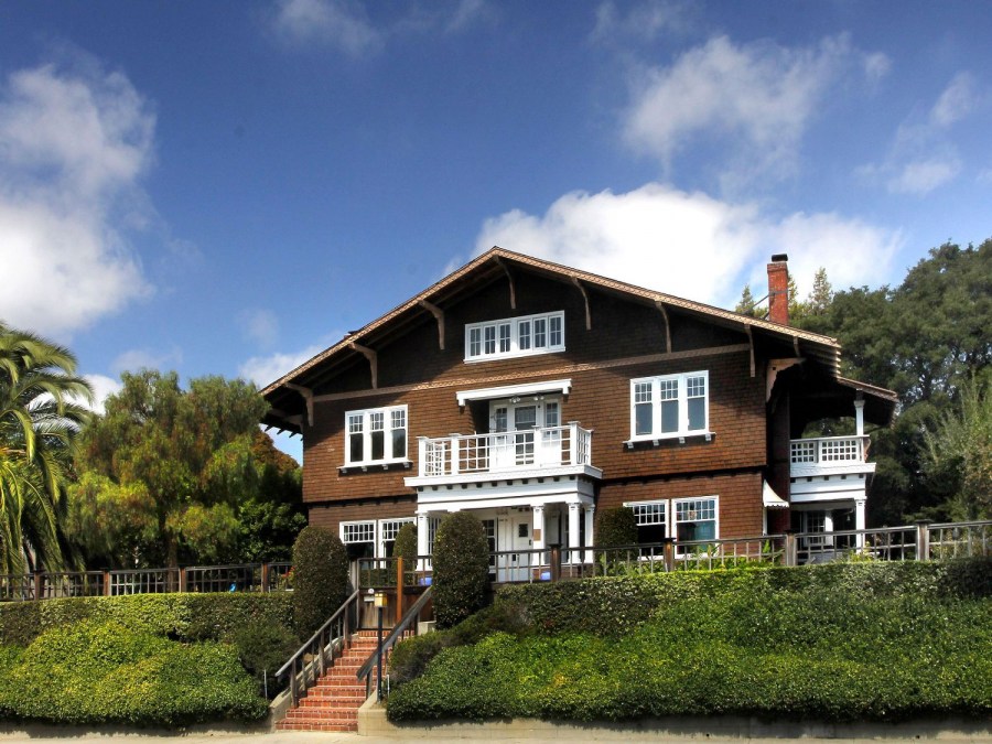
Monochrome facade
He considers this option a classic; it is suitable for conservatives who adhere to the traditional style in home decoration. If you are inclined to such a decision, it is worth considering some points that affect the correct choice of the main tone.
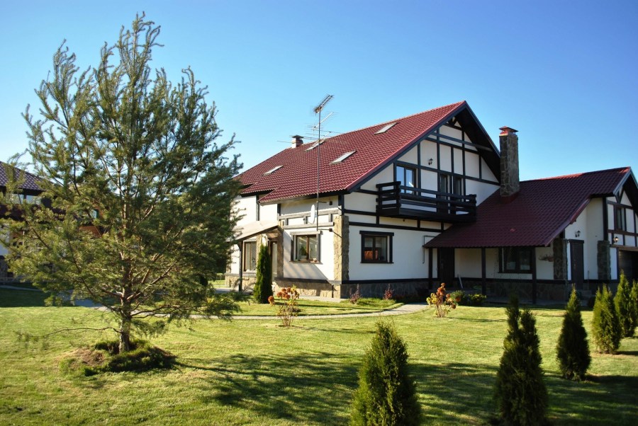
Natural colors are suitable for wooden houses, buildings in the style of "Russian hut." It can be all kinds of shades of brown, pastel colors. The castle-style house looks very beautiful in gray.
Consider the combination with the landscape and the nearest buildings - it should be harmonious. As the main one, it is better to choose the gamma that dominates the environment.
 In addition, it should be in harmony with green spaces and various small buildings on your site.
When designing the facade, it is worth remembering that this part of the house is the visiting card of its owners. She eloquently tells about the lifestyle that is familiar to them, will make the first serious impression on any guest. Therefore, the issue of its design must be treated very responsibly.


The selection of color combinations should be thorough and thoughtful, and the quality of the paint used should be the highest. Only this approach guarantees you an excellent result, and the house will become your pride.
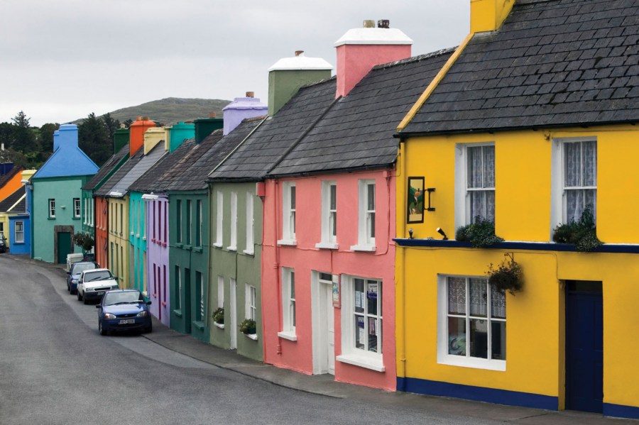
Photo color facade


Home interior design 2019 - 100 photos of the best interiors
Chain electric saw - modern models for giving or at home. Review of the best manufacturers.
Two-story house - successful projects for private residential houses and cottages (130 photos)
Join the discussion: